Archive
Lest we Forget – Real Heroes, all of them!
With the Japanese Skilled Veteran Corps in the news, http://bouhatsusoshi.jp/english and all the other troubles the world faces, I got to thinking about how lucky we are as species. There are heroes the world over and they are usually ordinary people making extraordinary choices, in what are (mostly) very unusual circumstances.
I bow to the Skilled Veteran Corps with humility and gratitude, for it is not only their own nations people who are at risk here, but potentially the human race in it’s entirety. None of us know the true extent of future problems a nuclear disaster may cause. But these people do know the risk they are taking and are choosing to do it anyway.
Let us never forget those people, whose names we may never know, who have been somehow instrumental in changing our world for the better when no one else could or would want to. This led me to thinking about the following work I produced, which was a tribute to unknown heroes, I only hope the world will see fit to make sure there is a truly memorable tribute to these Skilled Veteran Corps in the future.
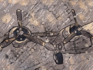
As a proud supporter of Our Troops, I was inspired by a visit to RAF Cosford, to produce something that, for me, had some resonance with the actual people involved in the workings and history of these amazing planes. The High profile airmen are most often those acknowledged individually but those folks who kept things going & working deserve to be recognised too.
This is my way of saying, “I see what you did, for me, mine, ours, and I appreciate it. Thank you!”
This is a piece I made using mono bock printing techniques with some, wax, Q-tips and white spirit thrown in the mix.
I made this after a visit to RAF Cosford http://www.rafmuseum.org.uk/cosford/ a great place to visit, with or without children.
There are all manner of flying machines and other historical military vehicles. The thing that stayed with me most though, was the sheer volume of rivets/welds on the aircraft displayed. It really put into context how much use these planes must have had, how much damage, and how ingenious the human race is. the pattern was so random, as the replacement panels must have been, I felt an ode to the Riveters & Welders was in order.
Resistance!
A #pitstopchat trend on Twitter had me answering a question about the image of Resistance.
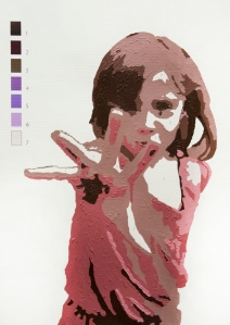
this took me back to last year, when I produced a cover illustration for a Uni brief on this very subject.
I went right back to our first experience of resistance as children, and wished to produce something using the body language of children, which spoke of the resistance between parent & child. Something as simple as not coming in for a bath. I was heavily influenced, and still am, by the honesty of Sally Mann’s photography regarding children, and wished to incorporate this influence somehow.
I came upon the vehicle of paint by numbers. As a child, I painstakingly applied the paint, neatly and within the lines, according to the colours that were given.
My response was to produce a subtle but negative effect in the veiwer. you see “Ah, paint by numbers!” then you realise something is not quite right about it. This is a portrait and as such, one expects to see certain things. But here is a child who is quite obviously in defiance, not in her best clothes or posed nicely for the camera. The way the Paint is applied is thick and full of movement. Short, quick & defiant strokes, not the usual, carefully applied paint. I considered making the colour switch more obvious but it somehow seemed too much. This little girl is so comfortable with my parenting that she feels able to stand up for herself when she needs to and the beaming smile she gave me after the initial photo was taken, is evidence of a safe kind of resistance, one which says, “I know my own mind, you may not always agree with me but I know you love me anyway!
A kind of feel good resistance.
Soon to be a Bee Keeper
I am almost, very nearly a Bee Keeper. My friend (& neighbour) and myself have a bee hive. It has been cleaned, prepared and ready to go for the last 2 years. We had both gone to Uni as mature students and this year sees my friend Graduate too and we are now in a position to go ahead. So the phone call has been made, order placed tomorrow and we’ll be eating our own honey next year, with any luck.
I have been so excited, I love Bees. They are fabulous things, we NEED them and Me & the Family love honey, so it’s a win win! I had to do a piece about Bee Phobia or Apiphobia or Melissophobia. I like the latter better as it is a reference to the bees love of Lemon Balm (Melissa officinalis) which is similar to, but different from Bee Balm, which is a type of Bergamot (I think).
Anyway, as a balance to making the phobia piece, I wanted to make something which celebrated Bees. I have been heavily into Typography/fonts for a while, learning all the time, and wished to use text in some way and I wished to combine all of this with my brand new shiny Graphics Tablet. The result was realisation of a concept which started with a letter B based on one from Tim Burton’s Sleepy Hollow. Brilliant Film, Loved the illustrations by Arthur Rackham for it which I saw in the Chris Beetles Gallery in London and I admire the way Mr & Mrs Burton (apologies Helena BC) live their lives. I would ‘Heart’ being able to live next door to my partner. I could go visit him when the mess gets too much at mine 🙂
Any way, you can see the influences. So after a few hours perfecting the letter shape needed, working it into a bug/bee and making various brushes, I got to work drawing on my Graphics Pad.
There is nothing quite like the first time I suppose, to draw on a surface and leave no mark is something reserved for mono prints or niche techniques. As someone who likes to doodle and sketch on paper, this was a new and slightly unnerving experience. This was unlike anything I could conseivably create by hand and the nature of digital allowed for changes and steps back you just can’t take with pen or paint. Some hours later, well maybe a couple of days, I produced the following image. I have an A3 print of it at home as it reminds me what asking questions and perseverance can do for you. Hope you enjoy it 🙂
My first real sale!
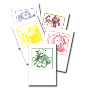
I am thrilled to have sold my first pack of cards! A full set of toy cards. Here they are ready to package and post 🙂
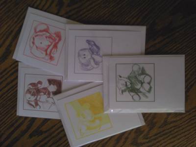
Finally got there!
Little sneak preview of my new online shop.
I’ll be adding more items over the next few days, and may be tweaking the site itself, so please bear with me.
Any comments on usability of site, requests for types of image or about the work, are appreciated.
Find my site here www.shellintons.com
Thanks
Pack of Gift Cards
I’m a little bit excited…
hence the late night post!
I got my website up and running today, paypal shopping cart and all. Working too, I got the lovely Mr P to buy my first thing just to check.
it needs tweaking and isn’t exactly stocked yet, but I am getting there. So off to sleep now, and will be choosing/uploading stock images tomorrow & when it’s all done, I shall be posting something about WordPress as a website & shop.
That’s all folks!
(showing my age there)
Everyone’s a critic :)
Help yourself!
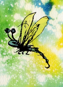
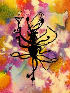
I am posting these two images to see which works better. Call it work in progress.
As a card, would a full front cover with a descrtiption inside the card be better, or some sort of ‘caught’ snapshot with a limited description on some sort of tag or label?
Helpful answers (and others) welcome!
or this one……….
the 2nd one has been vectorised and manipulated, somehow cleaned up slightly.
the 1st one I think retains more of the ‘feel’ of the Pen & Ink drawing I originally did.
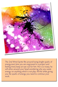
the colours are Eco-Line paints. I love them, so vibrant! There was salt and bleach used too as I recall.
Let me know what you think. I have a set of these sprites, each with their own ‘Quirk’ and each one is different from the next. I would like to finalise a format so I can get the sets printed up.
Art prints for the little un’s
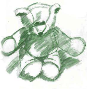
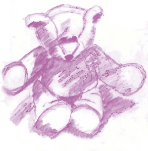
I am working on a set of sketches of toys which I aim to turn into Greetings cards and Art Prints for Children’s Bedrooms. Here is the first one.
I also did a pink version. Just thought I would add it in.
I was a sad loss to the diplomatic core…
But being blunt, sorry make that unable to keep quiet at times, paid off. At the monthly Busy Mums networking meeting run by the Lovely Grace Marshall of http://grace-marshall.com/ I was lucky enough to be shown Kate’s (of http://www.growingspirit.co.uk/ ) new products involving Crystal Essences and Essential oils. Kate is a talented Healer and I like her as a person and mentioned that her labels could be better. Ok, I admit I was a little blunter than that. But the upshot is that I got to design her new labels and it was lovely to be able to produce some work containing her lovely Butterfly logo.
My Thanks go to Kate for accepting me for who I am, bluntness and all and for allowing me the chance to help someone I like whilst doing a job I love.
More Bright Ink Pen Bugs
Just a couple more in the same vein. I am currently working on my ‘Sprite cards’ which I will be selling soon.
